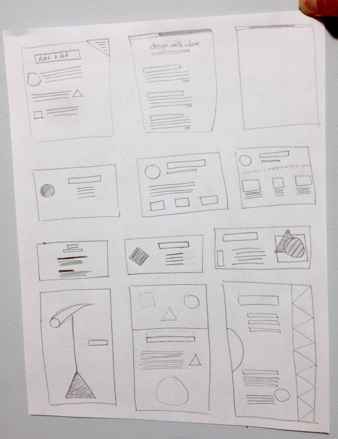
In today’s exercise, we’ll draw a bunch of small page layouts. This will help to improve the way you visualize web pages, and break them down into their basic parts. Rather tham spend a lot of time fleshing out the details, like text and other content, we’ll just be using basic shapes.
The inspiration for this exercise comes from the book Design Basics Index by Jim Krause. It’s a great resource for learning about design principles. I love how it has a ton of examples that show good versions of designs alongside the bad versions, and it clearly explains what makes the “good” one better. I’ve seen a few places so far where he’ll also give multiple iterations of a design, or multiple takes on the same theme.
You will need:
- Sheets of paper. 8.5 x 11 will do.
- A pencil
- An eraser (could even be attached to the aforementioned pencil)
- Beverage of choice (optional)
Begin by drawing a bunch of rectangular boxes on a piece of paper. Between 10 and 12 is a good number. You can make some of them web-page-shaped if you want, or shaped like tablets or phones. Or just go crazy and make some really tall or wide rectangles. The confined space might make you think of things you otherwise wouldn’t have, so it’s fun to experiement with some layouts that might not strictly map to a web page or app.
Next, fill those boxes with mini layouts comprised of simple shapes. Squares, circles, triangles, or yet more rectangles. And when I say “fill,” I don’t mean you should literally fill every last bit of space with a shape. Try to recreate some page layouts you’ve seen before, or try to mimic a business card layout, or a movie poster. Let your mind wander and come up with unique ways to use the space. Here are some that I came up with:

Don’t worry about perfection – you’re using a pencil with an eraser for a reason. And even then, the point here isn’t to turn out great works, but to exercise the creative parts of your mind to come up with interesting layouts, and begin to think about the composition of objects and empty space in your designs.
If you want more exercises like this one, and a lot of other info on design theory, be sure to check out the Design Basics Index book. I’m only 100 pages through and I think I’m already improving a bit. I should add that if you buy the book through a link from my blog, I’ll earn a small commission that’ll help me continue writing here in my spare time. So if you do, thanks.
Fill a few pages with these rectangles and mini layouts. At the end of doing a few of these, you’ll start to realize you’re thinking about things a little differently.
