Today we’re going to take an existing page and try to duplicate it pixel-for-pixel. The goal of this exercise is to get some experience with building a fully-designed web page down to the last detail, but without having to come up with the design yourself first. This one is pretty long, but I think the experience is worthwhile. If you finish this whole thing yourself, you should feel accomplished.
I purposefully tried to pick a page that was very simple, and one that many people would be familiar with. Without further ado, I give you the Google login page:
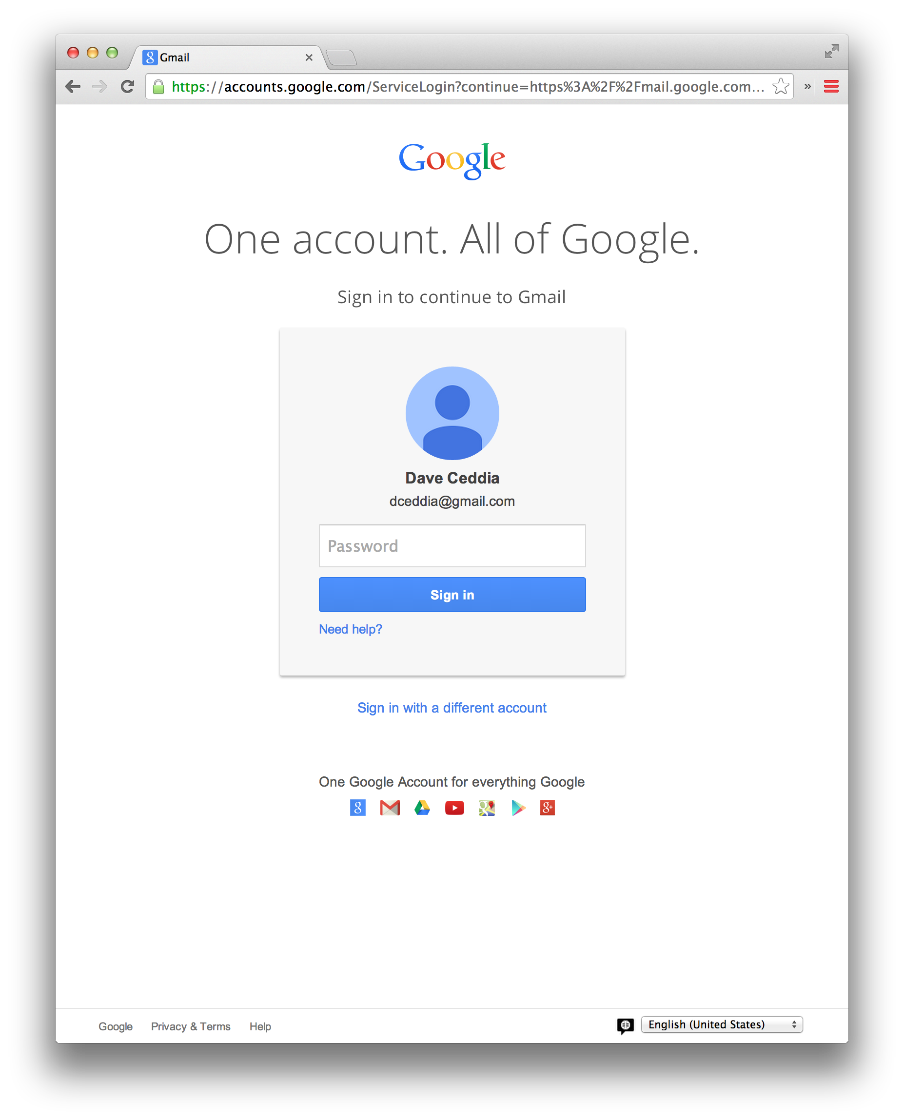
Let’s start by copying it on paper, first. Grab a sheet of paper and your favorite pen or pencil and just draw the page as you see it above. Here’s my attempt:
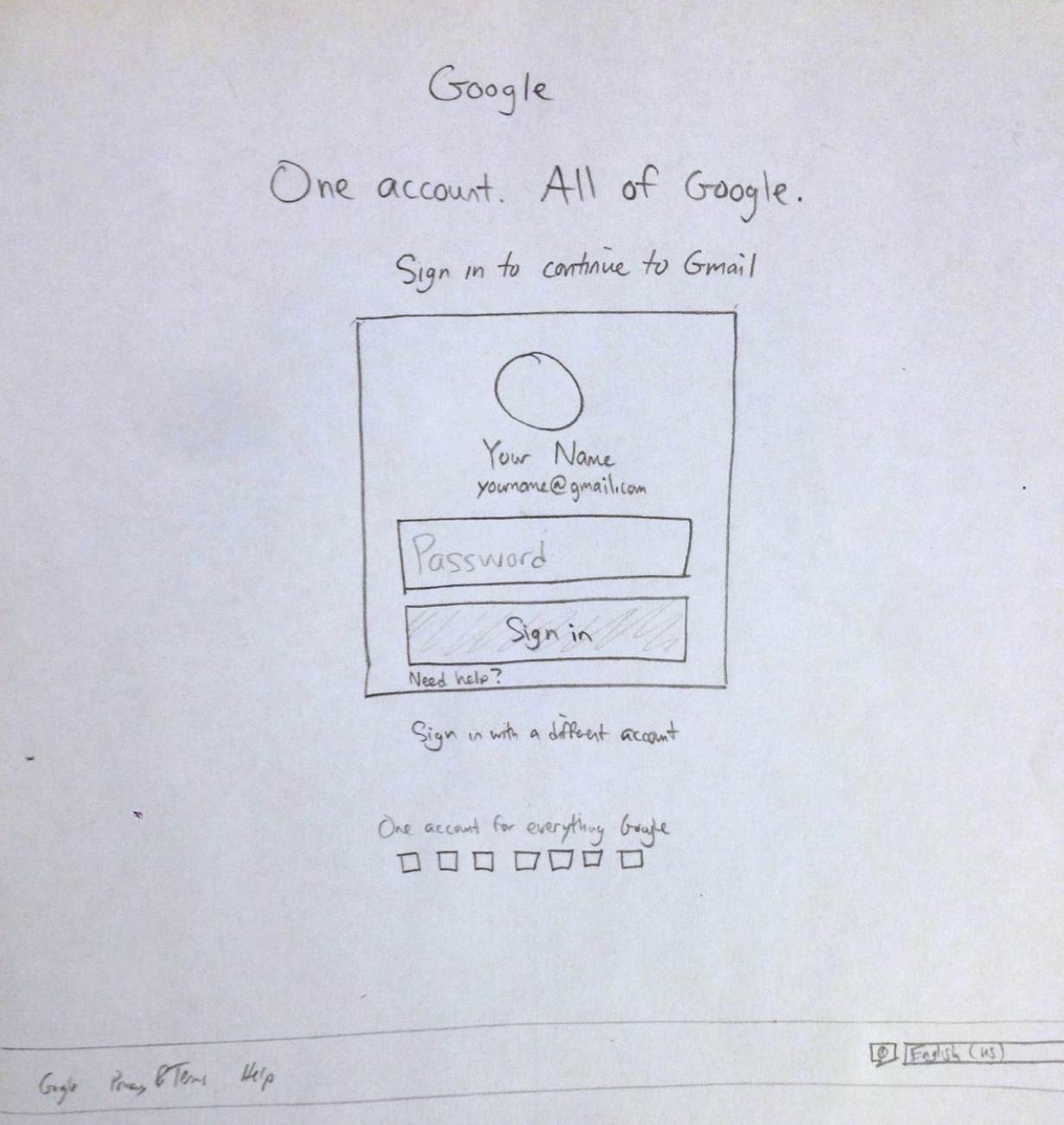
You can see that I’m not so great at centering things. Maybe you weren’t either. That’s ok. The general idea is there, even if the text is off-center and the spacing isn’t quite right.
From this sketch, we’ll begin building our clone. We’re starting from your sketch, instead of from the real site, because it’s more like what you’ll do during the first pass of your own page designs.
If you already have a workflow that you like to use – mocking up designs in Photoshop as the first step, for instance – go ahead and do that. I personally find that sketching on paper is just a faster way to get the ideas out, and the time spent nudging pixels in Photoshop will all need to be done a second time in CSS anyway.
Open up your favorite editor and start off with some boilerplate HTML code. I recommend creating a project directory to house all of the related files, because by the time we’re done we’ll have at least a couple files.
1 2 3 4 5 6 7 8 | |
Save this, try it out, it should be blank. Let’s add the initial few lines of content (we’ll use text instead of images for now).
1 2 3 4 5 6 7 8 9 10 11 | |
Refresh now, and you should see the text in 3 sizes. It looks pretty terrible so far. We’ll get there. Let’s add the form now, and since we know it’ll need a border around it, we’ll stick it inside a div.
Remember, the point of this exercise is to get better at this stuff yourself, not just to copy and paste my version of it. If you’re following along at home, you might have something like this now:
1 2 3 4 5 6 7 8 9 10 11 12 13 14 15 16 17 18 19 | |
At this point, if you refresh, we’ve got a mix of inline and block elements with no styling and it looks especially terrible:
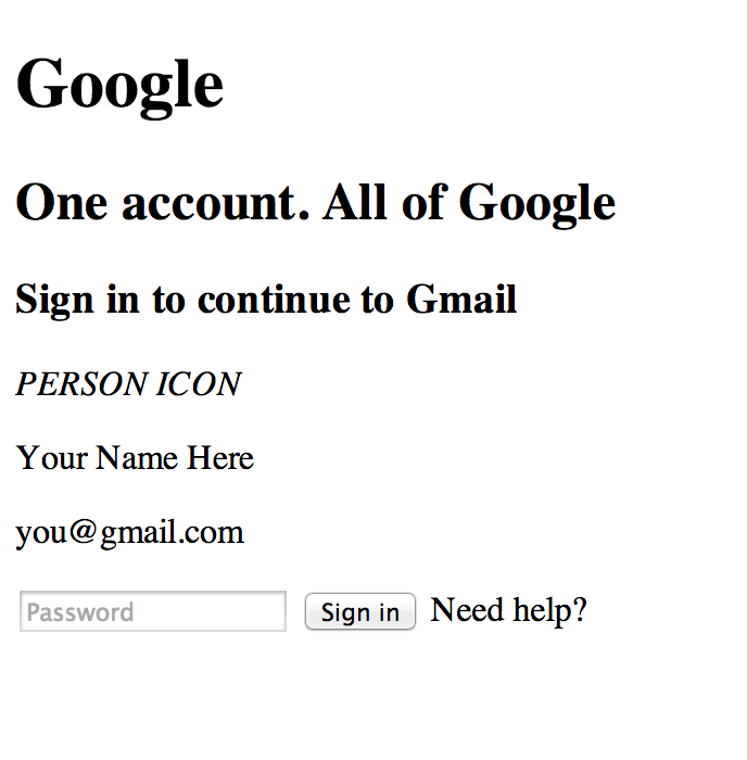
So let’s start to introduce some CSS at this point. Add the import to your
tag and let’s get working on it. Just come up with some rough styling for now, sizes and the like. Here’s the CSS and the result as I have it so far:1 2 3 4 5 6 7 8 9 10 11 12 13 14 15 16 17 18 19 20 21 22 23 24 25 26 | |
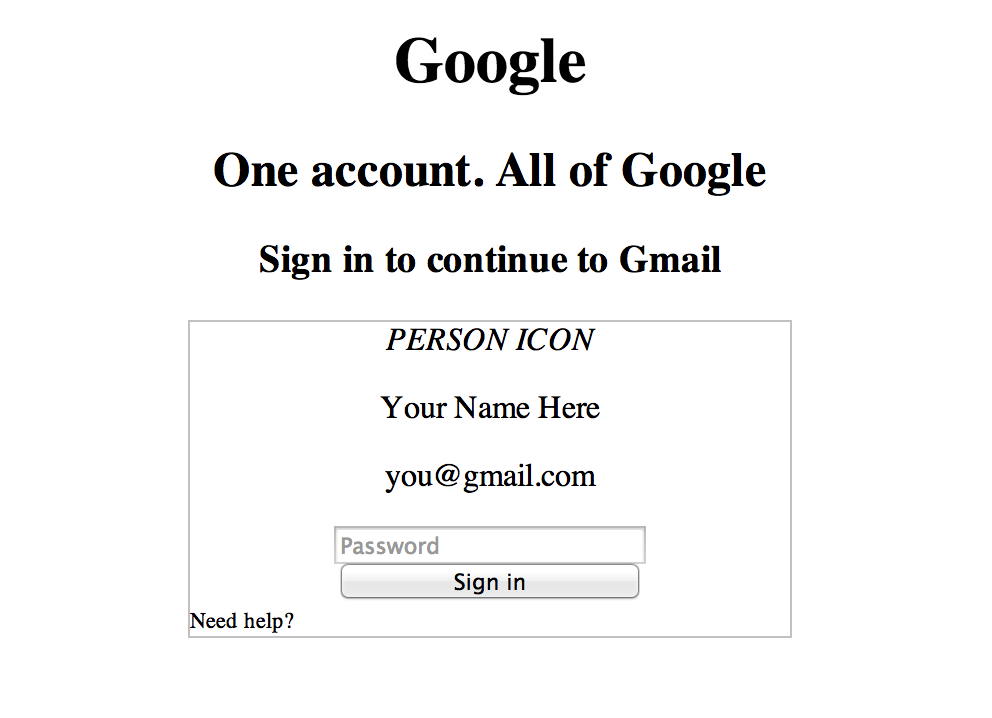
Notice that the “Need help?” text isn’t where it should be. I assumed that the inputs and the text would all be center-aligned, but maybe that’s not the best way to go about it. Open up the Chrome Inspector or Firebug, if you prefer Firefox, and take a look at how these elements are laid out. It looks like the way Google did it was to make the inputs 100% width, but put some padding inside the form box:
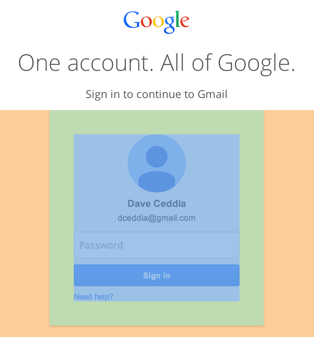
Let’s try doing it that way instead. I also collapsed two of the declaration blocks into one.
1 2 3 4 5 6 7 8 9 10 11 12 13 14 15 16 17 18 | |
Let’s fix some of the fonts now. Chrome Inspector/Firebug is your friend here, unless you’re already great at visually identifying different fonts. It looks like Google is using Arial for most of the smaller text and Open Sans for the headers. Luckily Open Sans is freely available (from Google, even!). Stick this line inside your
tag:1
| |
As a side note, when I copied that link from TypeCast (http://typecast.com/preview/google/Open%20Sans), the http: wasn’t included, and the font didn’t load locally.
Now we can add these two declaration blocks:
1 2 3 4 5 6 7 | |
It looks a little better already. Now look back at the real Gmail login page, and notice that the font sizes and weights are different. Let’s make it look closer to that, again using the Chrome Inspector. The “One account…” text is 38px with a weight of 300, and the heading below that is 18px with a weight of 400. Now we’ll add this:
1 2 3 4 5 6 7 8 9 | |
That instantly helps it look more like the real page. Let’s replace that h1 with the Google logo now. Delete the h1 and put this in its place:
1
| |
It’s a huge image though. The Gmail login page scaled it down to 116 x 38px, so let’s do that, and center it too.
1 2 3 4 5 6 | |
At this point we’re also going to reset the margins and padding for everything on the page, so we have more control over styling. We probably should’ve done this from the start but let’s add it now, and then we’ll go fix the spacing. Put this at the very top of your CSS file.
1 2 3 4 | |
Both of the headers (h2 and h3) have 15px bottom margins. Add those now. Then the name has a 10px margin above it, and the email has 10px underneath it. We’ll want to introduce some CSS classes for those elements now, so we can style them separately.
We can replace the placeholder “PERSON ICON” text with the real image, too. Copy the source from the Gmail login page. At this point our HTML looks something like this:
1 2 3 4 5 6 7 8 9 10 11 12 13 14 15 16 17 18 19 20 21 | |
And here’s the CSS:
1 2 3 4 5 6 7 8 9 10 11 12 13 14 15 16 17 18 19 20 21 22 23 24 25 26 27 28 29 30 31 32 33 34 35 36 37 38 39 40 41 42 43 44 45 46 47 48 49 50 51 52 53 54 55 56 57 58 59 60 61 62 63 64 65 66 | |
It’s looking pretty good at this point! If you didn’t notice the nifty trick they use for the profile image, I’ll point it out: that image is actually square, but the border-radius of 50% turns it into a circle using plain old CSS.
Alright, let’s flesh out the box. They use #f7f7f7 as the login box background color. The box corners are slightly rounded and there’s a drop shadow.
1 2 3 4 5 6 7 8 | |
(We removed our 1px dark border). It’s getting very close now. Fix the color of the headers to be #555 instead of the harsh solid black, and also they seem to use #404040 instead of black for the rest of their text, so put that in the body block.
One other thing that needs to be adjusted is to bold the user’s name and fix the spacing of the name and email address. The use a larger line-height on the email to give it some space, and decrease the font size to only 14px.
1 2 3 4 5 6 7 8 9 10 | |
Let’s make the password input fancy looking now. In addition to the normal style, theirs also has a hover style, a focus style. Let’s start with the normal one.
It’s tall and the font is a bit bigger at 16px. Then it’s got a little bit of padding on the left and right of 8px. Then we need to set box-sizing to “border-box”, otherwise that extra padding will push the input into the containing box’s padding. The border is a single pixel of #d9d9d9, but the top border is one pixel of #c0c0c0 to add a little depth. It’s also got a tiny tiny border-radius of 1px. If you A/B your version and the real Gmail login page now, you might notice that it’s off by a single pixel, and this is because there is a “margin-top: -1px” on that password box. Who knows why they added that, but we may as well put it in. Finally, there’s a 10px bottom margin to give some space between the password box and the Sign In button. Here’s the final declaration:
1 2 3 4 5 6 7 8 9 10 | |
Now we’ll tackle the hover state. For this, it’s handy to be able to reliably turn the hover state on so that you can inspect the CSS. In the Chrome Inspector, you want to click this tiny little button:
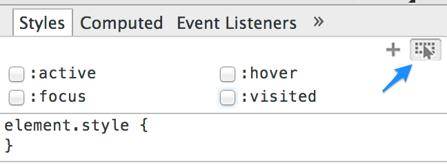
And then check off the :hover box. It looks like hovering changes the border color to be a tad darker, and also adds an inner drop shadow, like this:
1 2 3 4 5 | |
All that’s left for our password box now is to add the focus state. So check off that :focus box in Chrome’s Inspector and take a look at what changes. It looks to me that the inner drop shadow is still present, but it’s a tiny bit darker (alpha of 0.3 instead of 0.1) and the border changes to blue. They also remove the default blue outline provided by the browser for a cleaner look.
1 2 3 4 5 | |
Now we’re done with the password box, let’s do the Sign In button. It has active and hover states in addition to the normal one. Here’s the CSS for the normal state. Did you notice all of these attributes?
1 2 3 4 5 6 7 8 9 10 11 12 | |
The hover state differs by having a slightly darker background and border, as well as a more pronounced text shadow. That text shadow is still very minimal, though.
1 2 3 4 5 6 | |
Finally, the active state is very similar to the hover state, except that it has an inner shadow.
1 2 3 4 5 | |
Now let’s get the “Need help?” link to look right. It’s a 13px font with a blue color and text-decoration of none. The hover state has an underline:
1 2 3 4 5 6 7 8 9 | |
After doing this, if you compare with against the original login page you might notice that the “Need help?” link is a couple pixels higher in the original. This baffled me for a little while. Googling for “span space above” clued me in to the reason: inline elements get their line height from their parent element, even if the inline element has a smaller font size specified. One solution is to set the link’s display value to block or inline-block, but I went with the solution of setting the parent element’s font-size to 13px. After looking more closely, it appears Google used 13px as the font-size setting on their body tag, which is why everything renders nicely for them. Lesson learned!
So add “font-size: 13px” to the body, and also add “font-size: 16px” to the name element.
Now we’ll add the “Sign in with a different account” link underneath the form. It’ll start off way off to the left, so we need to center it. I chose to set the display to block and then center the text, but you could also do it with margin: 0 auto. It also needs some size adjustment to 14px. The space above it is actually provided by the form box, which I think is a nice pattern to follow because it means that you could switch out the element below the form without having to change any CSS, and the spacing would remain the same. I just eyeballed it as 20px, since they seem to be using 10px-increments and it looked like about half size of the padding inside the form box, and then double-checked it against the Chrome Inspector. Do the same for the bottom margin (30px). Here was my style declaration for the link (don’t forget to add the border to the form itself):
1 2 3 4 5 6 | |
The “One Google Account for everything Google” text and the array of images below it is what we’ll do next, and it’ll be similar to the link we just did. I used this markup:
1 2 | |
The img tag came right from the Gmail login page. Both elements need to be centered, and the p tag needs some space below it. The image has set dimensions, because the source image is twice as big as it needs to be for a non-Retina display. If you’re on a Retina, you might need to double the width and height for the image.
1 2 3 4 5 6 7 8 9 10 11 12 | |
The only thing left to do is the footer. I set it up like this:
1 2 3 4 5 6 7 8 9 10 11 12 13 14 | |
On the first pass I tried doing it without the ul, but it was easier to get the correct spacing with it wrapping the links. It’s more semantic that way anyway. Their markup also has all of the content wrapped in another div, but we’ll try to do without that and see how far we get.
The footer needs to stick to the bottom, so it’s absolutely positioned with a bottom of 0. It also has a fixed height and a gray 1px top border. We also need it to stretch the entire width of the window.
1 2 3 4 5 6 7 8 9 10 11 | |
You’ll also notice that we need some padding above and to the sides. Floated elements inside will be affected by the padding though, so we set the box-sizing to border-box. And then because of that box-sizing, the top border becomes included in the height, so we needed to increase the height by 1 pixel to make it match the original.
Inside the footer, we’ve got two components: the links, and the language selector. The links are floated left and colored gray, and the list that contains them is shown inline instead of with bullets.
1 2 3 4 5 6 7 8 9 10 11 12 13 14 15 16 | |
The language selector is floated to the right. While I was trying to get it to look like the original, the select box was positioned too low, and I struggled with getting it to be vertically centered. As it turned out, the trick was to vertically align the image to the top, which had no visual effect on the image but did fix the alignment of the select box. Weird.
I also set the width of the select box to 167px here, even though the original did not define a width, because it seemed like a cleaner way to get the right look without copying Google’s list of supported languages into our HTML.
1 2 3 4 5 6 7 8 9 10 11 12 13 14 | |
And with that, our work is done! Compare your work with the original Gmail login page and marvel at the lack of differences.
I hope this Carbon Copy walkthrough has been fun, and motivates you to try your hand at copying other designs out on the web. My goal is to provide you with design practice exercises that’ll increase your skill as well as mine.
This is the first one of these I’ve done, and I plan to do more, but I’m looking for feedback – about the length, the number of images, the explanations, everything. Leave a comment below, or just send me an email (dave@designwithdave.com). I’d love to hear what you think.
