Last time I wrote, I was working on some rough sketches for a garage door opener I’m building for myself. Since then, I’ve been working on building the device and recently got some time to work on the web interface.
Out with the old…
The first couple versions were similar to the drawings I posted last time:
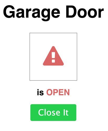
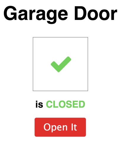
But the design felt kind of… boring. It was clean and flat, I suppose, but it didn’t have any character. And also, the colors were pretty bad, looking back on it.
So I went out in search of some fonts that might spice it up, and in my Googling I stumbled upon a photo of one of those imitation parking space signs. You know the type. “WARNING: Get Off My Lawn, You Dirty Kids.” Or whatever is fun to put on signs these days.
And a flash of inspriation came to me: I could design the page to look like a road sign! Like the kind you see on a highway telling you about the exit you’re about to take by mistake. Like this one:
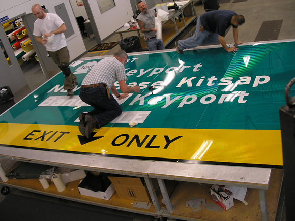 You never really grasp the size of a road sign until you’re standing on one.
…and in with the new
With the new idea in hand, I went looking for a suitable typeface (“road sign font”) and found this page: http://www.fontspace.com/category/highway – of the choices there, the one that I liked the best was Roadway. It seemed unmistakably like a road sign to me, even though it’s not the typeface actually used on highway signs. Those highway fonts are more about legibility anyway, and this page is going to be sitting 4” away from my face on a phone screen. Should be fine.
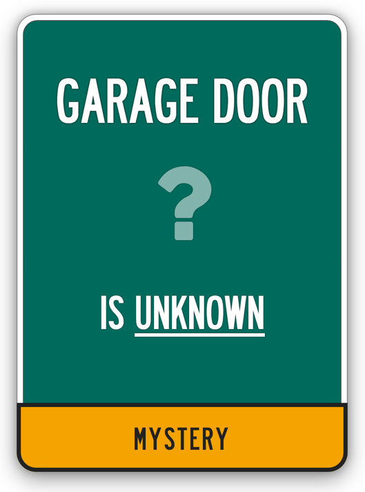
I took the green and yellow colors from signs in Google Images, and armed with Roadway and a frightening amount of time tweaking CSS shadows and border radiuses, came out with these:
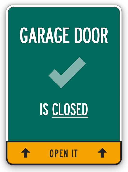
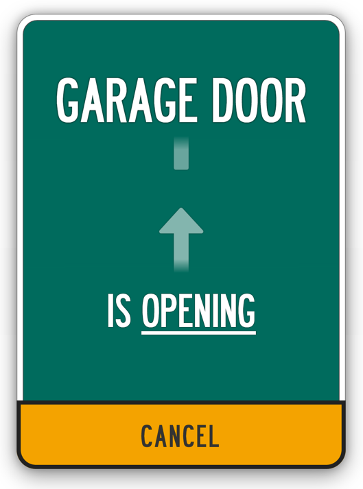
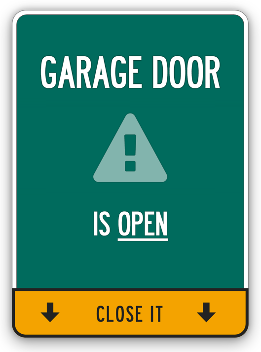
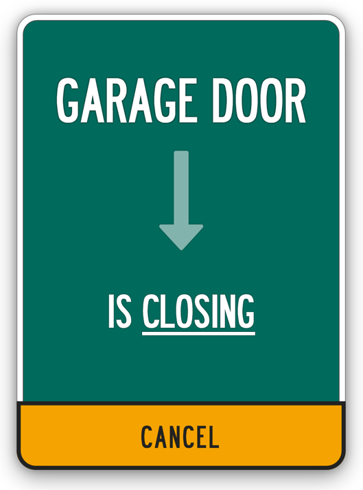
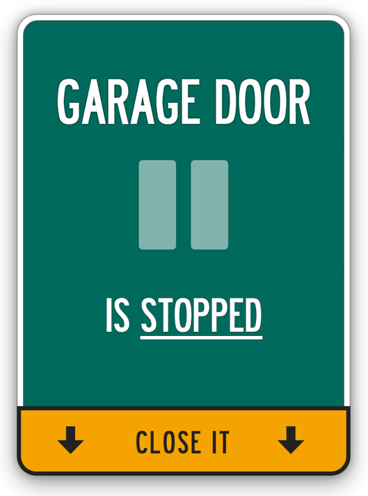
Here are a few things I learned along the way with this project.
Try the Extremes
One thing I realized is that it’s easy to get into a routine of tweaking the thing you have in front of you. Make the box shadow 2px larger, or 1 shade darker. Nudge the title 0.17em down. These little tweaks usually do improve the situation a little bit, but they’re not groundbreaking. Nudging some element 2 pixels to the left doesn’t make you go “Wow, I like this design a LOT better than the last one!”
To come up with something radically different, try tweaking things by large amounts instead of tiny amounts. Make something much much darker or lighter, or try doubling the font size. Maybe it’ll look ridiculous, but who knows? It’s hard to know what your eye will like until you actually see it.
And if you still don’t like it, go search for some more inspiration and play around with a totally new design idea. I’m much happier with the road sign concept for this garage door page than I ever would’ve been tweaking pixels on the first version.
Side-by-Side
Looking at all the different variants of a design can bring out aspects that wouldn’t appear you were just looking at one image. In this case looking at all of the different door states, each with its own icon and text, made me realise that the word “IS” looks redundant. Maybe I’ll try taking it out and then seeing how it looks in the individual versions.
Before & After
Go back and look at the original versions of your design once in a while. I hadn’t seen the first version since probably a week ago – I added Bootstrap, which broke some styling, and I just left it broken as I worked on the code and electronics to open and close the door.
When I checked out the code for that old design today to take these screenshots, I was amazed to see what me-from-last-week thought was a pretty cool design. It’s good to review your old work on occasion to see the progress you’ve made.
What Next?
Even now, looking at the new screenshots, I still want to change things. I’m not so sure I want to leave the word “IS” in there. The “CANCEL” button should have some icons, or maybe it should be red instead of yellow. I still need to animate the “CLOSING” state so it matches the fancy “OPENING” one.
That’s ok. It’s never easy to stop tweaking something and call it “good enough,” but at some point it’s important to move on to the next thing. Which in this case, is wiring up the circuit and installing it on the garage door.
And hitting ‘Publish’ on this blog post.
