Remembering to close the garage door is hard. I’m now living in the first place where I’ve had a garage and I’m having a difficult time making a habit of closing the door as I leave. It’s a potentially expensive mistake to make, and it’s also nerve-wracking being at work later and trying to remember whether I closed the door or not.
So, I’m building a garage door sensor + opener/closer device using a Raspberry Pi. It’s going to have a web interface, so I thought it would be fun to get some design practice in at the same time.
Ultimately, I want the device to be able to do a few things:
- Send me a text message if the door has been open too long
- Display whether the door is open or closed, on a web page
- Have a way to open or close the door from the web page
- Be secure enough that random people on the Internet can’t open my garage door
In this post, I’ll talk about ideas for the web page design and show some sketches I’ve come up with.
The next post will detail the creation of the page in HTML and CSS. I’ll post the project up on Github when it’s all done.
I started by drawing out some sketches of the interface. I would’ve used pencil and paper, except I got a drawing tablet recently, so it seemed more fun to use that. Rough, hand-drawn ideas were what I was going for, though.
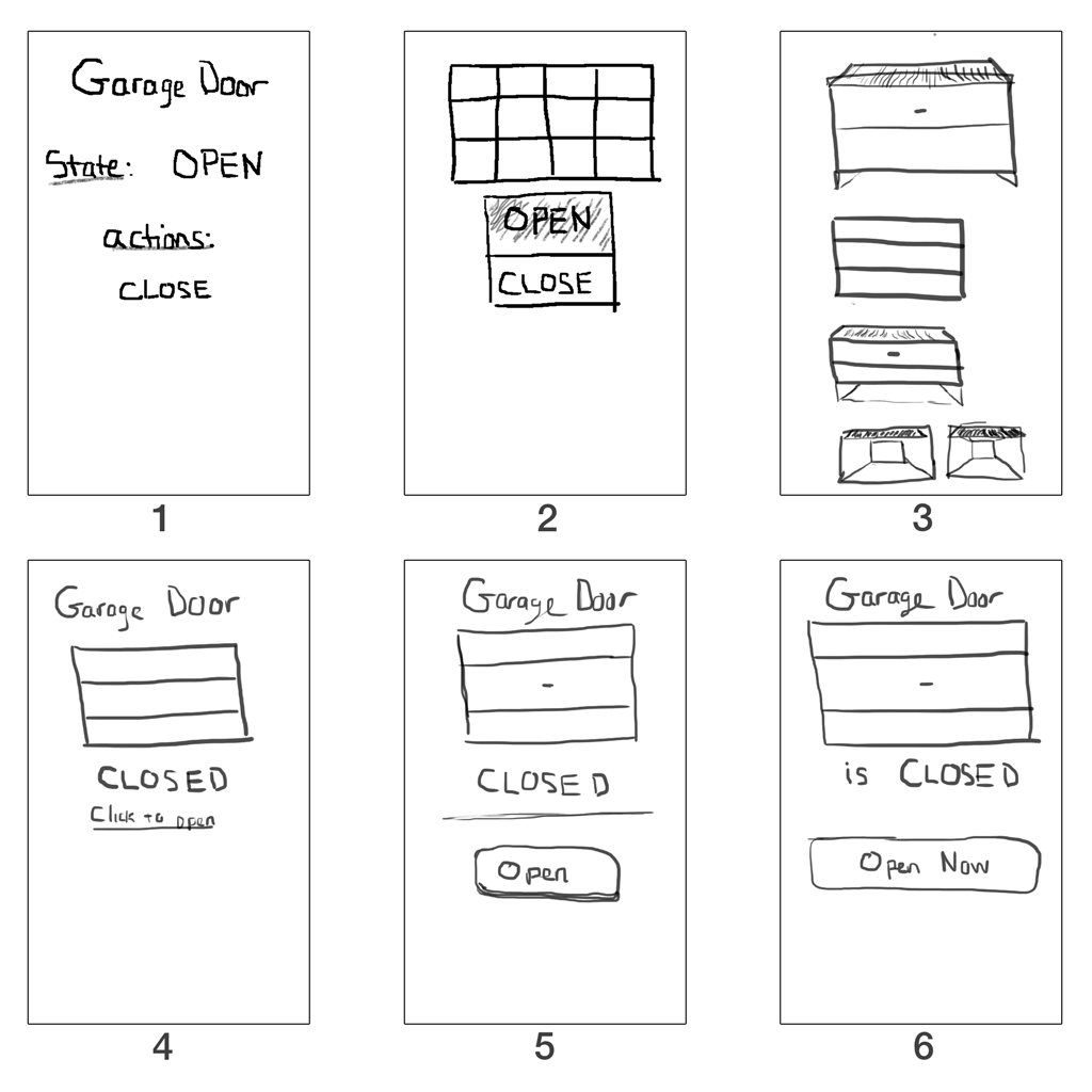
A lot of these were especially bad. #1 shows the important info and the action you can take, but it’s got no character. It needed an image of some sort.
#2 was my first attempt at a garage door, and some sort of 2-state button. It was here that I realized that the states should be “Opened” and “Closed” (not “Open” and “Close”) but present-tense doesn’t really work as the text for an on/off button.
In #3, I just doodled some garages. I’m not very good at drawing, as you can see.

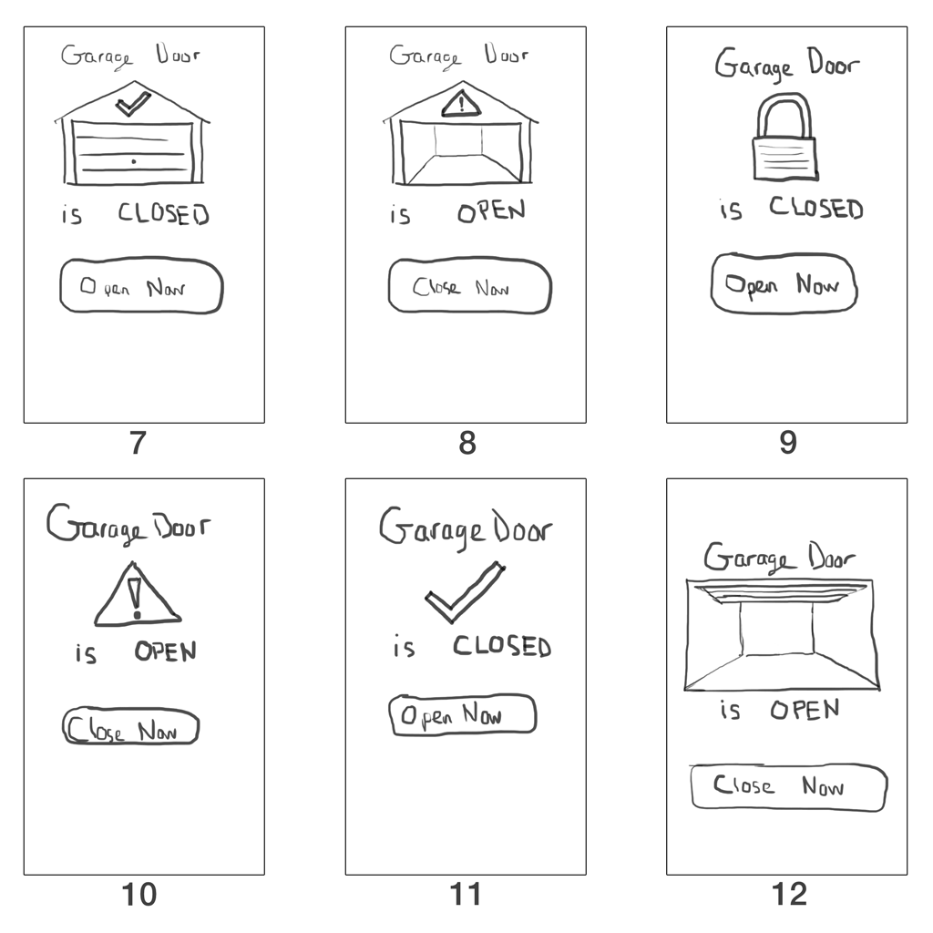
I liked #6 though, and I thought it had more potential than the others. So I took that idea of having an image sandwiched by text and ran with it for the next panel.
With these ones, I played around with different metaphors for the image. A garage door, a lock, a check/warning symbol. At the end of it, I liked the garage with the symbol above it the best, but the other ones were close behind. So hard to decide…

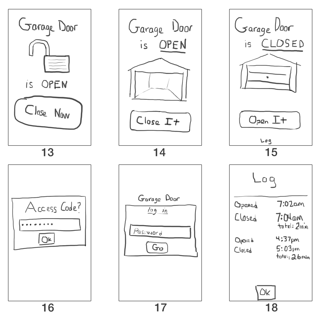
For the third panel, I started with the “open” version of the lock metaphor (#13), and I didn’t like it all that much. The open lock has a lot of visual weight on the right, and not very much on the left, and it just feels unbalanced.
#14 and #15 are a pair where I tried putting all the text above the image, and the button below. I didn’t like it quite as much that way, so I didn’t replicate it with any of the other images.
#16-18 were playing with the idea of having an access control page and a log of when the door was opened and closed. I like both of those features and I think they’re necessary, but I didn’t spend much time iterating on different designs for them this time around.

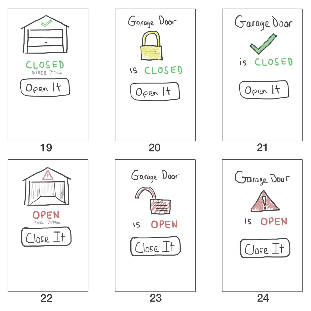
From all the previous sketches, I took my favorites and drew their open + closed states, and then added a little color for fun.
In #19 you can see a “since 7:04am” under the CLOSED state. I thought it might be nice to show some immediately visible info about when the door last changed state.
I also debated between whether the buttons should say “Open Now” or “Open It,” and went with the latter. It’s not a big deal obviously, but I thought “Open It” sounded more like a command that you’d give a computer.

So there you have it: my first few passes at designing an interface for a garage door opener. It’s been beneficial to start with tiny rough sketches rather than diving straight into trying to make a web page. Try applying the same technique to your designs and see how it goes!
And of course, if you have any ideas for a garage door opener, please leave a comment. It’s a wickedly simple app, but I’m sure there are plenty of other directions it could go. I’d love to hear yours.
