One thing that I always find difficult is how to lay out a new web page. Starting with a blank slate is intimidating, and it’s tough to know what should go where. You’ve got to worry about spacing and navigation and then you’re thinking about the pretty header design and the footer and the fonts and the colors…
Let’s try to get better at designing pages by starting at a high level with a simple problem to solve.
I want to start with a couple sites that I think are well-designed, or at least nice to look at. Following the idea that you should duplicate before you innovate, let’s take a look at a few examples and break them down into simple blocks.
Here’s MailChimp’s pricing page:
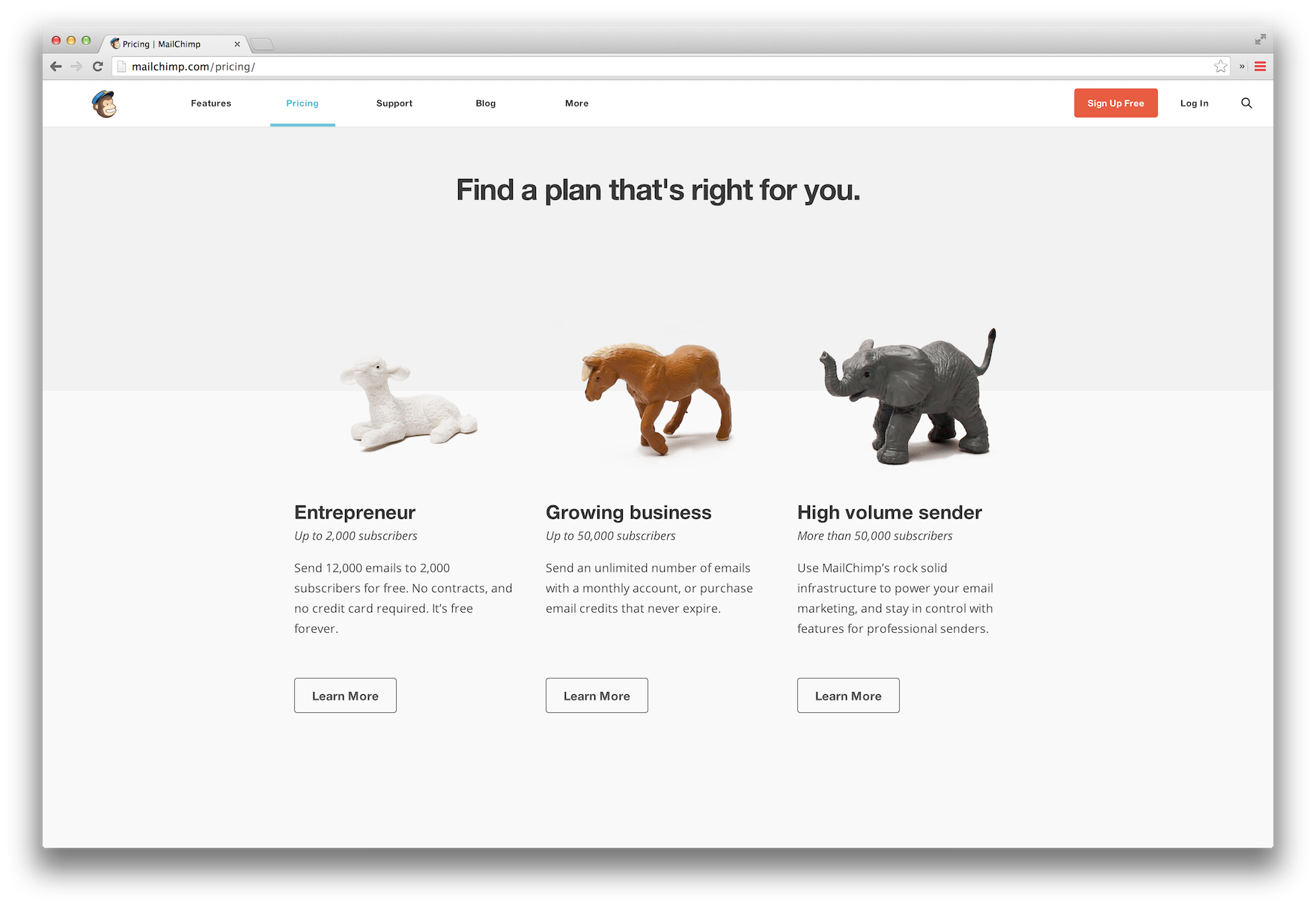
Let’s try drawing some rough boxes around the main visual elements here. I did this using the Preview app that’s built into OS X – you can use something fancy like Photoshop if you want, but don’t get hung up on tools at this point. I’d do this on pen and paper if I could, just to spend more time on the goal of outlining elements rather than aligning pixels. I find, for me at least, using fancy tools makes it too easy to get hung up on little details when I should really be worrying about the big picture. Anyway, here’s the MailChimp pricing page with some outlines:
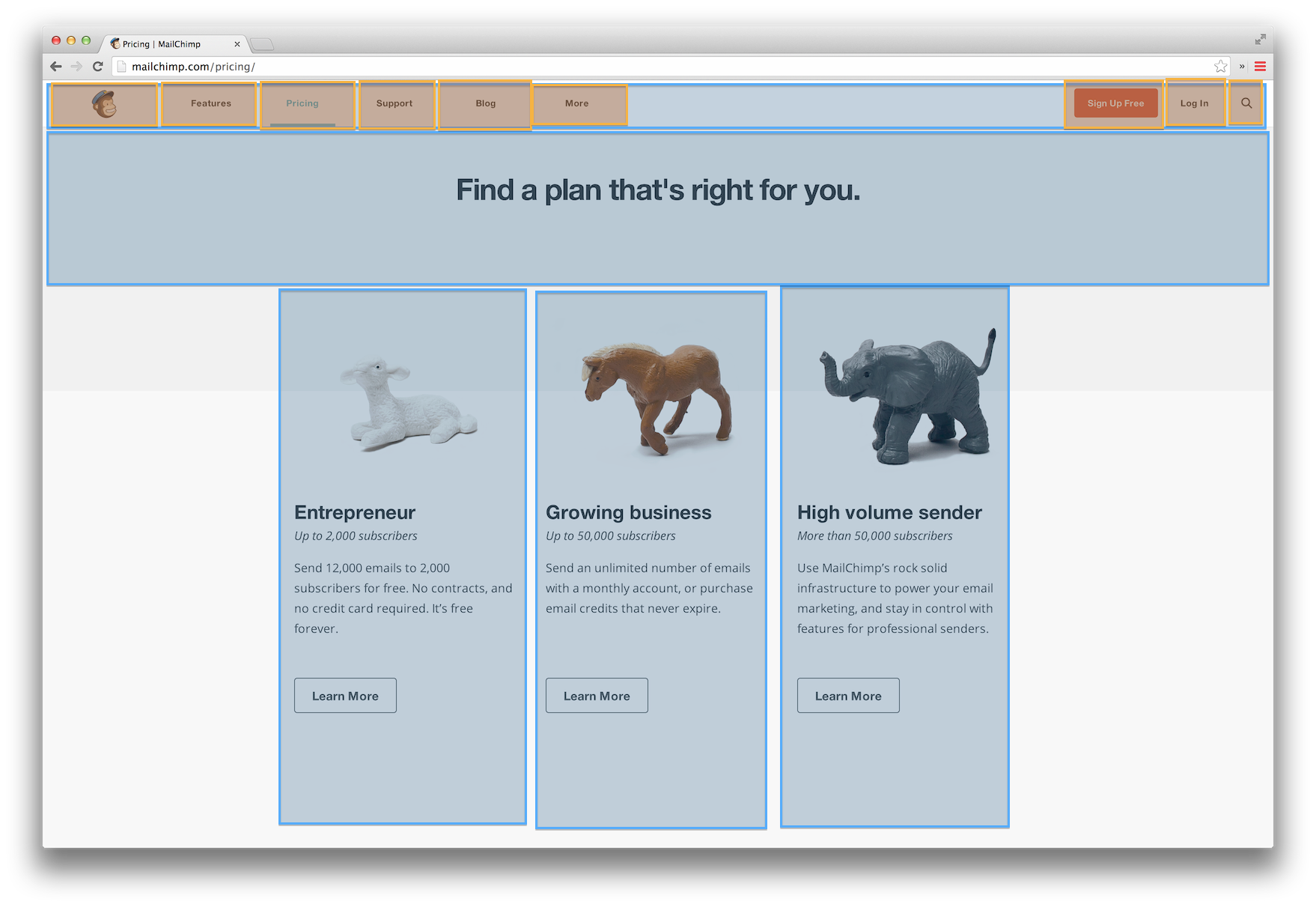
I made the large sections blue and the subsections orange.
A couple things that popped out to me as I was drawing the boxes (hopefully you tried drawing the boxes yourself):
- The content inside each of the 3 columns is not centered. It’s left-aligned. To my eye, this wasn’t really obvious by just looking at the original page. Something about those “Learn More” buttons made me think they should be centered, but when I tried to center the first one in the outlining box, I realized it wasn’t actually centered at all.
- There is a lot more space below the main header text than above it. That seems to have the effect of separating it from the images below so that your eyes process the 2 sections individually.
- The gray background behind the header text extends to about halfway down behind the images. This, along with the lighting in the pictures, gives them a 3D look and makes them pop out of the page.
- The menu items along the top (orange boxes) are almost evenly spaced out. Either that means that my boxes aren’t evenly drawn (likely) or that some of them needed special treatment – the “Blog” link seems to be further spaced out than the rest of its neighbors.
Ok, let’s look at Google:
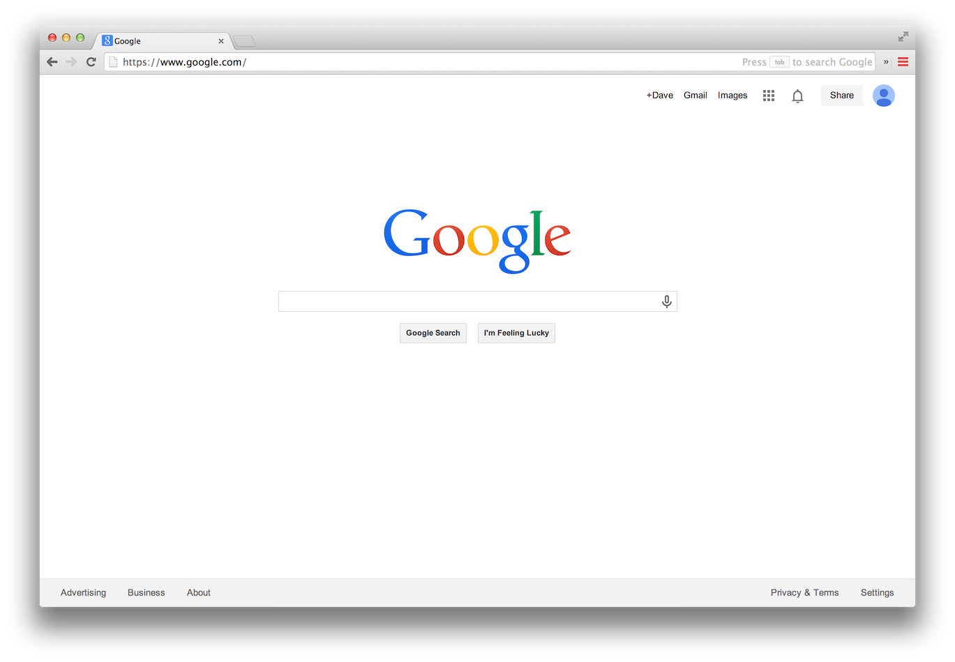
This one is very simple and minimalist. There are a few different ways you could carve it up into boxes though. Like this one:
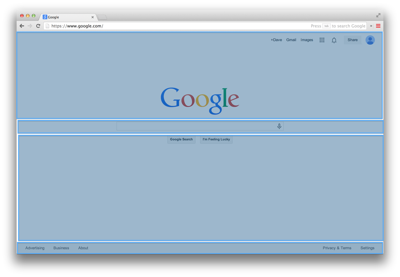
Or this one, which I think gets the essence across a little better:
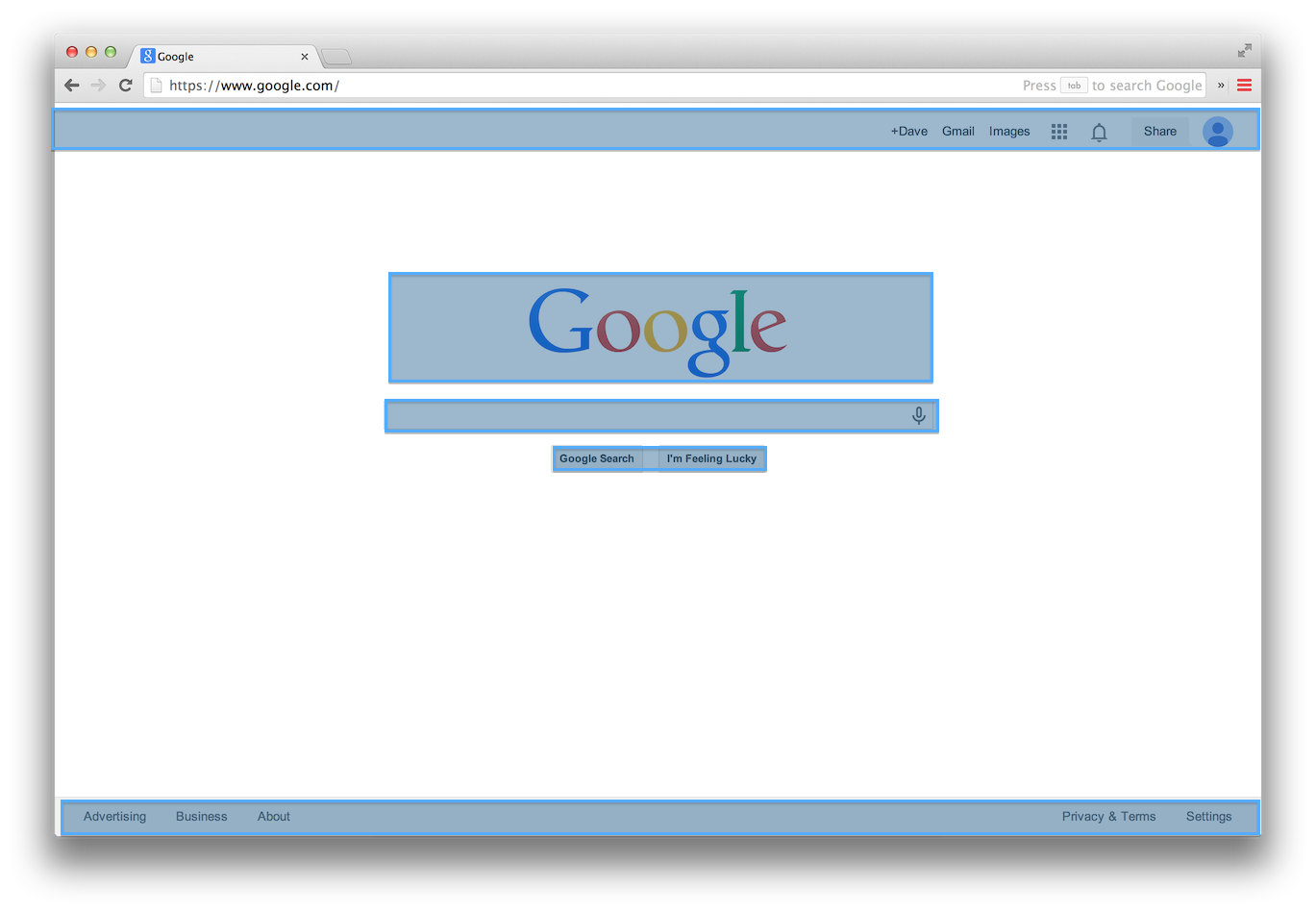
The point here, if there is one, is that there isn’t one right way to break a design into its outline pieces, but that it’s a useful exercise to go through because it trains your eye to see the larger structures at work in a design.
Your homework, then, is to go and find 5 of your favorite sites and perform this outlining on them. See if you can spot anything unexpected as you’re doing it. Try to break a design into boxes in a few different ways to see if you like one over another.
Maybe even go so far as to transfer your outlines to a real piece of paper – just draw the boxes, and see if the site is still recognizable. I’d bet Google and Reddit would be fairly easy to recognize, even as a simple collection of boxes.
I’m hoping that a bit a practice at this will make it second-nature, and after a little while we’ll be able to look at a site and mentally break it up into boxes. Which is a great first step in being able to create your own designs.
