This morning, I saw that Nathan Barry posted a 24-hour Challenge of sorts – to create and launch a product, from scratch, in 24 hours. He’s making up a set of design exercises and I volunteered to be one of the early supporters and go through some of the exercises and provide feedback.
One of them was to redesign a Twitter clone while restricting the types of changes I could make: only size, position, and contrast. In other words, move stuff around the page but don’t change any fonts, add anything new, or take anything away.
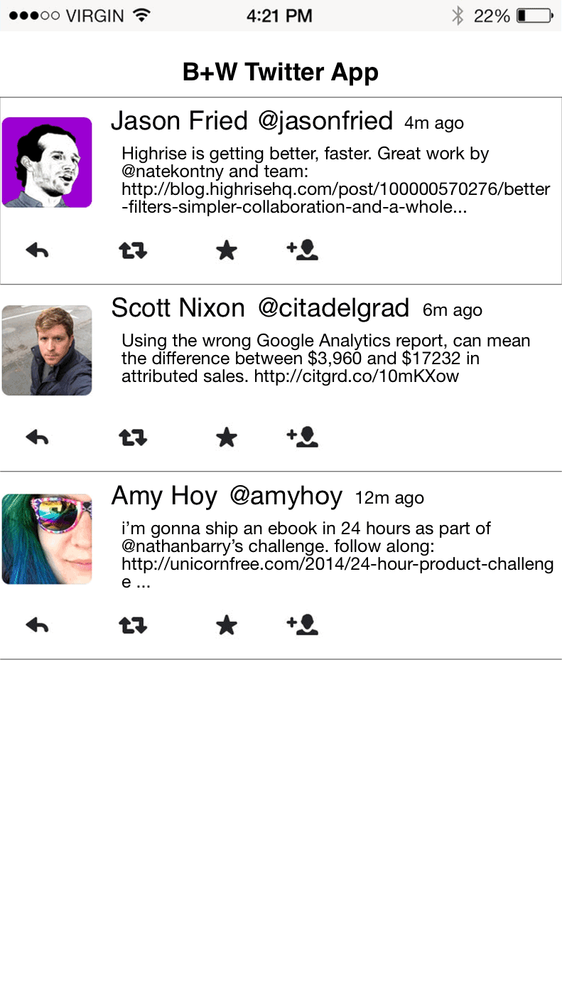
The original version is in black and white (aside from the images, anyway). I should note that this isn’t Nathan’s original – I recreated (most of) it in Photoshop so I could change the elements around.

Let’s go through some things that make it look less than stellar.
What’s Wrong
Avatar position – The avatar icon for each user is squished up against the left side of the page. There’s a tiny 1 or 2 pixel space, but the image feels cramped over there.
Name/tweet alignment – The tweet text is indented underneath the person’s name, and it makes the layout look unaligned.
Size of name + handle – The name and Twitter handle are the same size so they have the same visual weight. I’d argue that the name is more important than the handle, though, and that their sizes and/or colors should reflect that.
All that blank space at the bottom – Sorry. That’s my fault. Nathan’s original had 2 more tweets at the bottom, but I just got lazy duplicating them in Photoshop and gave up at 3.
Attempting a Redesign
I tried to address each of the issues in the redesigned version (well, except the missing tweets).
 Before
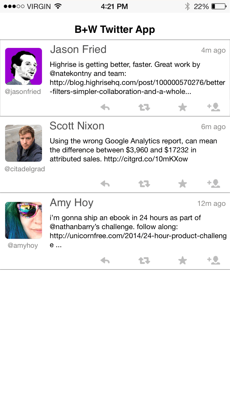
 After
After
Here’s what changed:
Text spacing for the tweet body was increased a bit for readability.
The avatar image was bumped in so to give it some breathing room from that left edge.
The tweet age was reduced to a middle-gray color, to de-emphasize it, and then it was pulled to the right to make all the ages line up. They’re easier to scan this way, since you know they’ll be on the right side. In the original version, your eye needs to “find” the time on each line, because its position varies with the width of the user’s name and handle.
The @handle was moved under the image, and resized much smaller. This created some much-needed whitespace between the user’s full name and the tweet age.
The action icons moved to the right to balance out the composition, and I made them a bit lighter to make it easier to focus on the text of the tweet.
The user names were toned down a bit, again so it’s easier to focus on the tweet.
Looking at it now, there are still a few things I could go back and tweak. And I think my version is an incremental improvement, but not drastically better. But it was a fun exercise! I’d recommend giving it a try.
{ Unnamed product }
As of this writing, Nathan is still hard at work finishing up his design exercises. From what I’ve seen and worked on so far, I think it’ll be a great way to get some design practice, and at only a few bucks it’s hard to go wrong. Check it out if you’re looking for some exercises to improve your own designs.
