There are countless fonts available on the web today. How do you go about choosing one for your design? You can flip through the endless typefaces availabe on Google Fonts or Font Squirrel or Typekit, but after a while they all start to look the same. It reminds me of sniffing candles and trying to choose the best one. After about 5 of them, I just can’t tell any more.
One of the reasons it’s important to think about the font you choose is because fonts have personalities. They imply meaning just by virtue of the way they look, and some of them speak stronger than others. If you match the font’s personality with the meaning you’re trying to convey, you’re golden. But if you do something like this, well…
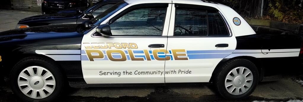
 Comic Sans on a police car does not inspire confidence.
So let’s try to work through some examples of fonts that match their content.
Find a Font for This Text
We’ll start with text and try to match fonts to the feelings they give. Here’s the first one:
REWARD: $20,000
When I wrote this I was imagining a poster from an old Western movie. I’m going to open up Google Fonts and search for a nice font for this text. Why Google Fonts? Well, basically, because it’s free. Their selection might not be the best, but I haven’t bought a subscription to Typekit yet.
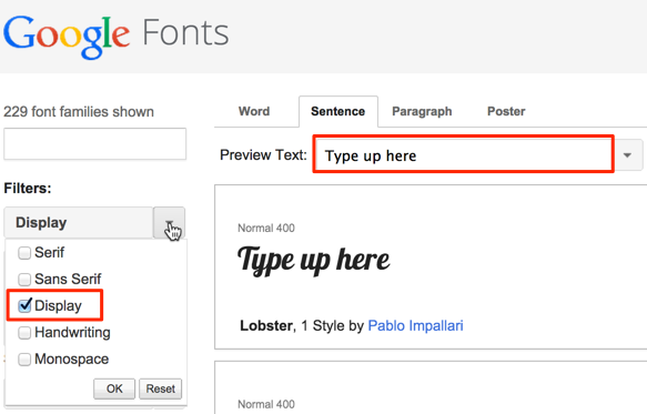
Anyway, Google Fonts has a filter mechanism, so we’ll uncheck everything but Display. These are the fonts suitable for titles or other small amounts of text – most of them wouldn’t work well for entire paragraphs.

Type in our text into the Preview Text box at the top, and just start scrolling until something looks like it fits.
You’ll probably notice that certain fonts jump out at you as completely wrong for this text. This one looks more suited to the cover of a fancy cat magazine, for instance:
REWARD: $20,000
On the other hand, this one might fit the text if you were thinking of a wanted poster from somewhere in the Terminator universe:
REWARD: $20,000
Finally, this one fits what I originally had in mind:
REWARD: $20,000
You can see that it’s possible to ascribe completely different meaning to the same text just by changing the font around. This makes typography a really powerful aspect of your designs, and one that you should give careful consideration.
Going through the fonts Google has available, I saw a few others that would fit the mood I wanted for the text. There are often many suitable options, and it’s hard to pick the best one. There might be no true winner. But there are usually plenty of obvious losers, like the fancy cat one above, or Comic Sans.
Find Text for This Font
Let’s try the opposite approach now. We’ll take a font and try to write some text that fits with it. This first one is called Press Start 2P. This one reminds me heavily of video games, especially something like Mario. I think something from a video game would fit here…
LEVEL UP!
This next one looks pretty obvious too. It’s called Graduate. It reminds me of a poster I saw once with a well-known fellow drinking a beer:
College
The third one is called Flamenco, and this one is more subtle. It didn’t call out any particular references in my mind, but it looks like the kind of font that should be used for some kind of pithy saying. I think it benefits from an italic style though.
The best things in life are free.
Go Practice!
I hope these examples have given you some ideas for ways to get better at choosing great fonts. Like everything else about design, it’ll take some practice to get better at it. Have some fun with it!
It’s useful to have the most common typefaces memorized so when you come upon the question of which font to use for something, you can reach into your bag of frequently used ones.
If you’re not already a member of the weekly newsletter, be sure to subscribe with the box on the left!
